The living room is the physical anchor of our daily lives. Much like a carefully managed digital platform serves as the gravitational center for a brand’s community, the living room is the ultimate community space of the home. It is where families debrief after a long day, where guests gather for conversation, and where we retreat to recharge.
However, facilitating that kind of effortless connection requires more than just pushing a sofa against a wall and mounting a television. A successful community space requires a physical anchor—a gravitational center that pulls the seating arrangement together.
Historically, this anchor was a massive, rectangular wooden monolith placed dead in the center of the rug. But as modern homes shrink in square footage and open-concept layouts blur the lines between rooms, the bulky wooden rectangle has become a logistical hurdle. How do you establish a strong, functional center to your living room without suffocating the space and creating a cluttered obstacle course?
The Psychology of the Anchor
To understand why a room needs a center point, we have to look at the psychology of interior architecture.
When you place seating in a room without a central table to bridge the gap, the furniture feels as though it is floating. The space lacks tension and purpose. A central table acts as the connective tissue of the “conversation circle.” It provides a shared surface that gives guests a place to set a drink, rest a book, or play a game. This shared utility naturally encourages people to lean in toward one another, physically fostering interaction.
However, when that central anchor is too large, too heavy, or improperly placed, it acts as a barrier rather than a bridge. It restricts traffic flow, making the room feel cramped, chaotic, and fundamentally unwelcoming.
Mastering Visual Weight
The secret to anchoring a room without cluttering it lies in mastering “visual weight.”
Physical weight is what a piece of furniture registers on a scale; visual weight is how heavy it looks to the human eye. A solid, dark mahogany block absorbs light and visually dominates a room, instantly making the square footage feel smaller.
To reduce visual weight while maintaining a strong anchor, designers utilize specific materials and silhouettes:
- Transparency: Glass or high-grade acrylic surfaces are the ultimate cheat code for small spaces. Because the eye can travel completely through the table to the rug below, the table takes up almost zero visual real estate.
- Elevated Bases: A table that sits flush on the floor feels like a roadblock. A table raised on thin, spindly legs (like classic mid-century modern hairpins or sleek architectural metal) allows light and air to pass underneath, drastically lightening its presence.
- Light-Reflecting Surfaces: Polished marble, travertine, or high-gloss lacquers bounce light around the room, contrasting heavily with the light-absorbing qualities of matte, dark woods.
The Rise of Organic and Modular Shapes
Beyond materials, the physical shape of the anchor is evolving rapidly. The rigid, sharp-cornered rectangle is being replaced by silhouettes that promote better traffic flow.
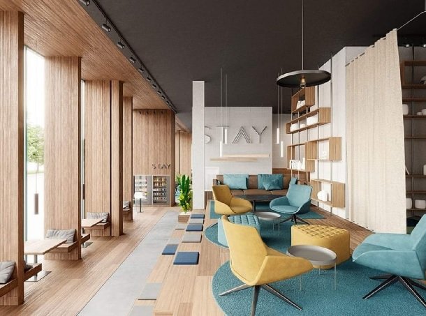
The Organic Curve: Round, oval, and organically shaped “pebble” tables are incredibly effective at softening a room. Because they lack sharp, 90-degree corners, they naturally guide human traffic in a smooth, fluid circle around the seating area. This eliminates the awkward “shuffle” required to squeeze past a rectangular corner, immediately making the room feel more spacious and easily navigable.
The Nesting System: For ultimate flexibility, many designers are abandoning the single table entirely in favor of modular “nesting” systems. This involves using two or three smaller, asymmetrical tables of varying heights that slide under one another.
When the room is empty, they cluster together to form a beautiful, layered architectural focal point. When the room is full of guests, they can be pulled apart and distributed around the space, ensuring everyone has a surface within arm’s reach. It is the perfect marriage of high-end aesthetics and practical, adaptable community design.
The Golden Ratio of Clearances
Even the most beautifully designed, visually light table will make a room feel cluttered if the mathematical clearances are wrong. Interior design relies heavily on standardized spatial ratios to ensure a room functions properly.
- The 18-Inch Rule: There should be exactly 14 to 18 inches of clearance between the edge of your sofa and the edge of your table. Any closer, and guests will bang their knees; any further, and they will have to uncomfortably strain forward to set down a cup of coffee.
- The Two-Thirds Rule: To maintain proper proportion, your central table should be roughly two-thirds the length of your primary sofa. A table that is too small will look like a mistake; a table that is the exact same length as the sofa will look overwhelmingly massive.
- Traffic Pathways: Ensure there is a minimum of 30 to 36 inches of clear walking space between the outer edge of the table and any other major obstacle, such as a media console or a fireplace hearth.
Conclusion
A living room without a center is just a collection of chairs; a living room with the right anchor becomes a true gathering space. Whether you are hunting through architectural salvage yards or searching for the best coffee tables in Portland, ME, the objective remains the same. By prioritizing visual lightness, embracing organic shapes, and strictly adhering to spatial clearances, you can design a living room that feels expansive, inviting, and perfectly engineered for human connection.